
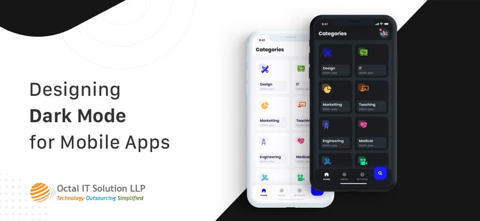
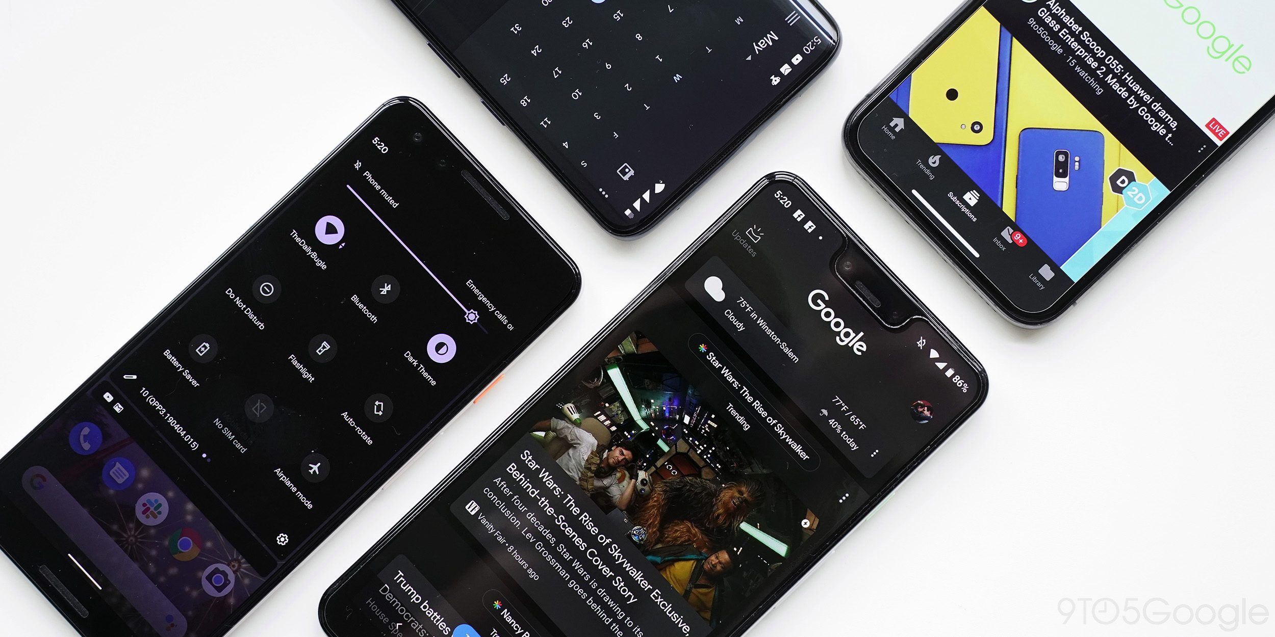
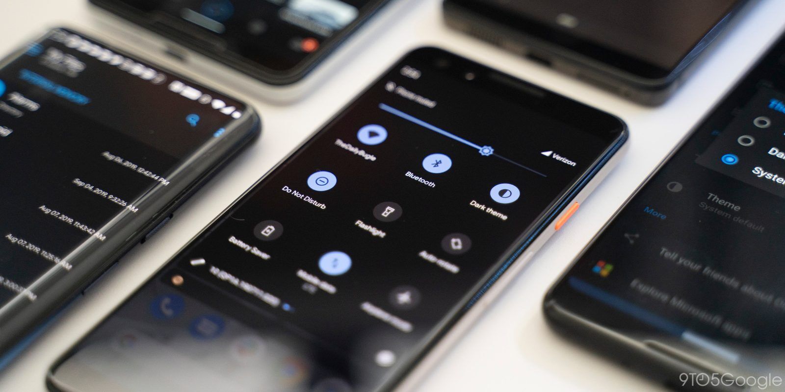
There was a time when dark mode was a rarity in the technological world but things have changed dramatically over the last year or two and now dark mode is on everybody’s lips. Stakes of dark mode has risen since last year when macOS launched dark mode and things got even more interesting for the dark mode when Google declared a universal widespread of Dark Mode at Google I/O 2019 Conference.
Reasons behind this surge in the popularity of dark themes are a lot such as less strain on the eyes while using smartphones or laptops. They can be read with much more ease in light. They can lower the consumption of battery to a great extent.
But creating a Dark mode theme for apps is a tricky task to take on because you can’t reuse colors or invent the colors. However, if you decide to do this then you should prepare yourself to gather results exactly opposite to what you expected. Designing dark mode apps incorrectly will in turn make the reading even more difficult for users in low light. Dark theme’s low brightness gives more safety in the dark ambience and that is why Google and Apple decided to invest so heavily in dark mode.
Also Read – Top UX UI Design Agencies To Hire
Reasons to opt for Dark Mode
Increases Battery Life
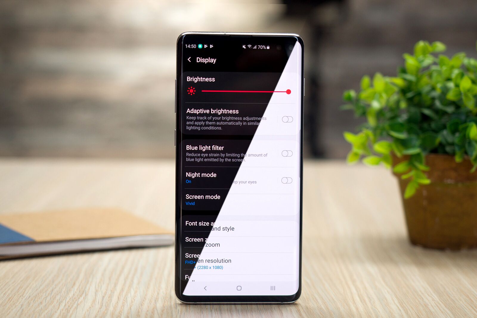
It has become a worldwide known fact that dark mode has the tremendous capacity to prolong the battery life of smartphones. The dark mode and OLED screens are a match made in heaven and this is what increasing the battery lives of all the devices which uses dark mode.
In Popular Demand
The popularity of dark mode has skyrocketed since the last year and it is not stopping anytime soon as it is growing with each passing day.
Health Issues can be solved
Apps which uses too much brightness damage your eyes in the long run. This is where dark mode act as a game changer. It relaxes the pupil of the eyes and allows your eyes to work on applications in the dark. This in turn solves the major health and wellness related issues out there.
Impacts of unhealthy Dark Mode
To understand these in details, we first need to get a hold of Fuzzing effect or Halation. If we get hold of this fuzzing than larger percentage of our problem will be solved as it is the biggest challenge in creating a healthy dark mode.
When you are reading a white text on a black background, it creates pressure on the iris of the eye as it opens up more and since it opens up more it receives more light and this causes a deformation of the lens which in turn creates a frizzier focus in your eyes. Unhealthy dark mode can prove to be catastrophic for your eyes as it is high in contrast and can create a lot of stress on your eyes in a short amount of time.
As we have discussed earlier also, dark mode helps in prolonging the battery life of your phone. So, its effect can only be seen on the devices that features the OLED screen. Exhaustion level of the users is pretty high after they are exposed to this impact.
Recommended Read: Cross Platform Mobile App Development Company
Changes brought by Apple to Dark Mode on iOS 13
By working on the dark mode, Apple has brought back the context of colors and UI Styling in iOS. Let us dive straight in to some of the changes made by Apple in Dark Mode:
System Colors
Nine predefined system colors that are supportive of dark system-wide appearance and dynamic has been introduced by Apple. Speciality of these colors is that they modify according to the chosen interface styles.
SF Symbols
Over 1500 SF Symbols has been enlisted for designers and iOS app developers to use in their apps in the human interface guidelines. Since they look great in the Dark Mode, they have been optimized for both dark and light UI.
Semantic Colors
Apple introduced semantic colors for generally implemented UI components to balance out the feel and appearance of the iOS apps both in dark and light mode. These semantic colors introduced by Apple do not feature the optimal RGB value; instead, they alter the iOS interface style directly.

Apart from all this, semantic colors can help out the designers to deal with the overlay text and color in the dark mode.
Blur and vibrancy effects
To date, Apple has launched 8 vibrancy effects and 4 blue effects with iOS 13, and these effects change to the iOS interface style automatically.
These effects aside, Apple has also introduced 4 vibrancy effects in iOS dark mode typography suit, out of which 1 is for separator and the other 3 are for overlay.
Recommended Read: Top iOS App Development Companies
Effective Steps to Create a Dark Mode for Mobile Apps
Hold yourself back from using saturated colors
We all know that saturated colors paints a beautiful picture on light surfaces but visually vibrate against the dark surfaces and make the process of reading a text off dark surface even more difficult. So, in order to make the contrast sufficient against the dark surface, we need to de-saturate the main colors.
Colors in the range of 200-50 on the lighter shades will provide a great readability on the dark surfaces.
Make use of ‘On’ colors for text
‘On’ colors can be easily found on top of the key surfaces and elements. Since the default ‘on’ colors is pure white, it vibrates visually against the dark backgrounds and for this sole reason, Google Material Design suggests the users to use a little darker white.
Reduce the use of large blocks of bright color
At times, we use large blocks of bright color in light themes. Although, it is okay to use them but our most necessitous components is to be brighter.
Make distant surfaces darker
A guiding rule is followed by the background colors in dark themes for UI elements and that rule states that if the layer is closer to the user, the surface area becomes lighter. A light source is cast from high up in this model. If the layer is distant, it is bound to get less amount of light and recede more into the background.
Visit Also: Reasons to Hire Android App Developers in India
You should use your light theme’s primary surface color and then invert the color in order to create your dark theme’s primary surface color. After performing this task, make this color dark for distant surfaces and light for closer surfaces.
Think upon your theme’s emotional aspect
If you are looking to design dark theme for your app then you need to involve similar type of emotions in the dark mode. But your thought process should be clear on this regarding the fact that colors are recognised on the basis of their background.
You should be aware of the fact that both type of themes whether dark or light induce different types of emotions.
Try not to use pure black color
The dark theme that you are looking to create should not be of white text on black background because it is really hard to explore a high contrast screen. Dark grey theme as the main color reduces a lot of strain on the eye. Apart from this, it is easier to stare at shadows on a grey surface in comparison with the black surface.
Read More: Top Mobile App Development Companies in India
Animations and illustrations using dark theme
Heavy graphical components such as animations ask for modifications in dark theme also. In case of illustrations, if they consist of a background and a subject then you better de-saturate the background colors completely to keep the constant focus on the subject.
Examination of design both in dark and light theme
Examination of your design gives you a chance to look into the appearance of your UI in both type of themes and then modify your designs in order to accommodate very type of theme.
Darken the theme’s colors
When you decide to moderate your text to part ways with the halation and eye fatigue, the colored buttons and accents of yours may seem very bright. You need to do some modifications to these colors in order to work better in dark theme. What you need to do is lower the lightness of these colors so that they don’t beat the closer text. After this, maximize the saturation so that they have a character.
Complete the accessibility color contrast principles
Surfaces that you are going to use should be dark enough to showcase the white text. If we have a look at Google Material Design recommendation, then you should use a contrast level of at least 15.8:1 between the background and text.
Putting elevation tool to use
The function of elevation tool is to communicate the components’ hierarchy. Apart from this you can use shadows in the light mode for expressing elevation.
Read More: Top Mobile App Development Companies in USA
On & Off button in the hands of the users
Allowing the users to have control over switching on and off the dark mode is exciting but it can cause poor user experience. This happens because this allows you to take control of the users and allows the system to make decisions for itself.
Get Our Services: Hire hire ui ux developer
Conclusion
Dark themes have become very popular these days as it has a lot of advantages. But the thing is that they are hard to implement properly. But this article would have certainly helped you in providing a layout to design a dark mode effectively so that it does not causes unwanted strain on your eyes. Get ready made custom mobile app for your business.

 By
By May 20, 2026


 Latest Stories
 Get in Touch

